Configuring the Header or Navigation Bar in Materia X2 Theme
The Header or also known as the Navigation Bar (Navbar) in the Materia X2 Theme consists of several elements such as the Navigation Drawer Menu Toggle Button, Blog Logo Image and Title, Search Bar, Search Button, Dark or Light Mode Toggle Button, More Menu Toggle Button, etc.
Table of Contents
Navigation Drawer Menu
In the Header or Navbar, a hamburger icon button will appear to open the Navigation Drawer Menu and if you have enabled and set the menu items for the Navigation Drawer Menu.
Blog Logo and Title
There are several options that can be adjusted to your liking. Here are some steps to set the Blog Logo and Blog Title:
- Go to Blogger Dashboard and select the Layout menu.
- Look for the section titled Header Logo and Title and click the edit button (pencil icon) on the Header (Page Header Gadget).
- A Header Configuration Popup will appear.
- In the Blog Title input, enter the name of your blog.
-
In the Blog Description input, enter your blog description.
In Materia X2 version 3.0 and above, the Blog Description input will appear as a Secondary Title under the Main Blog Title.
-
In the Image section, there is two Radio Button Options. There are two options which you can use. Here is the explanation:
- Input image URL - You need to paste the uploaded image URL into this input.
- Upload an image from your computer - You need to upload a new image from your computer by clicking the Browse button and selecting the logo image you want to use.
-
If the Image section is already set, you can set the placement on in the Image Placement section. There are three options which you can use. Here is the explanation:
- Behind title and description - To display the Blog Title only.
- Instead of title and description - To display the Blog Image or Logo only (Without the Blog Title text).
- Have description placed after the image - To display Blog Image or Logo, Blog Title and Blog Description (Secondary Title).
- You can skip the Shrink to fit option. Even if you set it, it still does not have any effect on the image.
- If so, click the SAVE button.
- If you set Image Placement to Instead of title and description (To display the Blog Image or Logo only), then Blog Title text will be hidden from interface (Not Removed) because blog title is very useful for Search Engines.
- If you're using a blog logo as an image, make sure it's no more than 36 pixels high and the width will adjust accordingly. We recommend using transparent images in .PNG, .WEBP, or .SVG formats.
Search Bar and Search Button
The Search Bar element consists of a Submit Button, Search Input, Clear Search Input Button and Close Search Button.
On the desktop screen, a search bar will appear. While on the mobile screen, the search bar will be hidden and a toggle button will appear which is useful for opening the search bar. In addition, the button to close the search bar will only appear on the mobile screen.
The button to clear the text in the search input will appear if you write something into it.
Color Mode Toggle Button
The Color Mode Toggle Button on the Header or Navbar will appear when you have enabled the Color Mode Feature.
More Menu
The More Menu Toggle Button in the Header will appear when you have enabled and set the menu items for the More Menu.
Customizer Settings
There are several Options and Color settings for all elements in the Header or Navbar.
Options for Header or Navbar
There are several Header or Navbar Options that can be customized, namely:
Navbar Translucent
This setting is useful for enabling or disabling transparent Header or Navbar. Here are some adjustment steps and explanations:
- Go to Blogger Dashboard and select the Theme menu.
- Click the CUSTOMIZE button.
- Click Advanced, click Default Options Dropdown and Select Navbar Options.
-
Look for the Option named Navbar Translucent (Disable | Enable), drag the slider right or left. Here is the explanation:
- 1px: Disable - The Navbar Transparent will be disabled.
- 2px: Standard - The Navbar Transparent will be enabled with 20% Blur.
- 3px: Medium - The Navbar Transparent will be enabled with 40% Blur.
- 4px: Large - The Navbar Transparent will be enabled with 60% Blur.
- 5px: Extra Large - The Navbar Transparent will be enabled with 80% Blur.
- Click the Save button (diskette icon) in the lower right corner.
Navbar Animation Event
This setting is useful for enabling or disabling Event Animation on Header/Navbar. Here are some adjustment steps and explanations:
- Go to Blogger Dashboard and select the Theme menu.
- Click the CUSTOMIZE button.
- Click Advanced, click Default Options Dropdown and Select Navbar Options.
-
Look for the Option named Navbar Animation Event (Disable | Snowflake), drag the slider right or left. Here is the explanation:
- 1px: Disable - The Animation Event will be disabled.
- 2px: Snowflake - The Animation Event will be enabled with Snowflake Effect.
- Click the Save button (diskette icon) in the lower right corner.
Navbar Description
This setting is useful for enabling or disabling Blog Description on Header or Navbar. Here are some steps to customize and some explanations:
YouTube Video: Indonesian Guide (Subtitles/Closed Captions available).- Go to Blogger Dashboard and select the Theme menu.
- Click the CUSTOMIZE button.
- Click Advanced, click Default Options Dropdown and Select Navbar Options.
-
Look for the Option named Navbar Description (Disable | Enable), drag the slider right or left. Here is the explanation:

- 1px: Disable - The Blog Description will be hidden even if you have entered the Blog Description input.
- 2px: Enable - The Blog Description will be visible.
- Click the Save button (diskette icon) in the lower right corner.
- Navbar Description is not part of the Blog Title, actually just the secondary Blog title which will only be visible to the user.
- You can also disable the Navbar Description by removing the Blog Description text in the Header Gadget.
Navbar Edge Style
This setting is useful for changing the Header or Navbar edge style. Here are some steps to customize and some explanations:
YouTube Video: Indonesian Guide (Subtitles/Closed Captions available).- Go to Blogger Dashboard and select the Theme menu.
- Click the CUSTOMIZE button.
- Click Advanced, click Default Options Dropdown and Select Navbar Options.
-
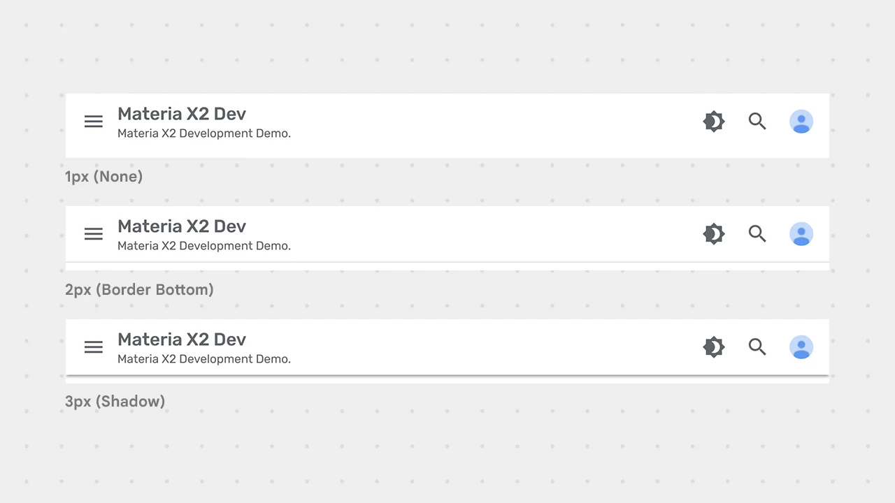
Look for the Option named Navbar Edge Style (None | Border Bottom | Shadow), drag the slider right or left. Here is the explanation:

- 1px: None - Header or Navbar without any edge styles.
- 2px: Border Bottom - Header or Navbar with border at the bottom.
- 3px: Shadow - Header or Navbar with shadow at the bottom.
- Click the Save button (diskette icon) in the lower right corner.
- If you set the Navbar Edge Style to 2px (Border Bottom), then you can also set the color of the border. You can set it in the Color Settings for Header or Navbar section below.
- If you set the Navbar Edge Style to 3px (Shadow), then you can also set the color of the shadow. You can set it in the Color Settings for Header or Navbar section below. Apart from that, you can also set the Navbar Edge Shadow Thickness.
Navbar Edge Shadow Thickness
This setting is useful for adjusting the thickness of the Shadow on the Header or Navbar. Shadow thickness is measured in dp units.
Note that this setting is only useful if you have set the Navbar Edge Style to 3px (Shadow).
There are three options that you can choose from, including 2dp (Thin), 4dp (Medium) and 6dp (Thick). Here are some steps to customize and some explanations:
- Go to Blogger Dashboard and select the Theme menu.
- Click the CUSTOMIZE button.
- Click Advanced, click Default Options Dropdown and Select Navbar Options.
-
Look for the Option named Navbar Edge Shadow Thickness (Thin | Medium | Thick), drag the slider right or left. Here is the explanation:

- 1px: Thin - Header or Navbar with Shadow Thickness 2dp (Thin).
- 2px: Medium - Header or Navbar with Shadow Thickness 4dp (Medium).
- 3px: Thick - Header or Navbar with Shadow Thickness 6dp (Thick).
- Click the Save button (diskette icon) in the lower right corner.
Navbar Button Corner Radius
This setting is useful for setting the rounded corner radius for the buttons on Navbar (Except Search Bar Button). Here are some steps to customize and some explanations:
YouTube Video: Indonesian Guide (Subtitles/Closed Captions available).- Go to Blogger Dashboard and select the Theme menu.
- Click the CUSTOMIZE button.
- Click Advanced, click Default Options Dropdown and Select Navbar Options.
-
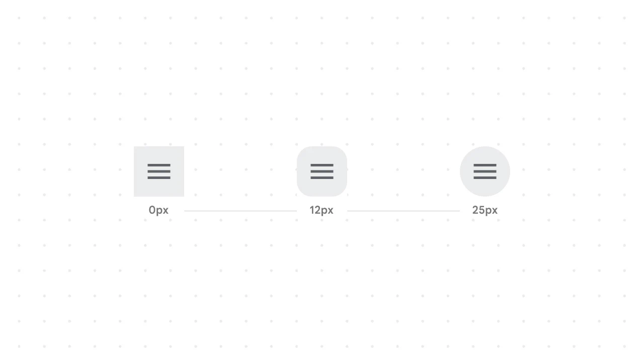
Look for the Option named Navbar Button Corner Radius, drag the slider right or left until you find the corner radius you want.

- Click the Save button (diskette icon) in the lower right corner.
Search Bar Max Width
This setting is useful for setting the minimum and maximum width for the Search Bar. Here are some steps to customize and some explanations:
YouTube Video: Indonesian Guide (Subtitles/Closed Captions available).- Go to Blogger Dashboard and select the Theme menu.
- Click the CUSTOMIZE button.
- Click Advanced, click Default Options Dropdown and Select Navbar Options.
-
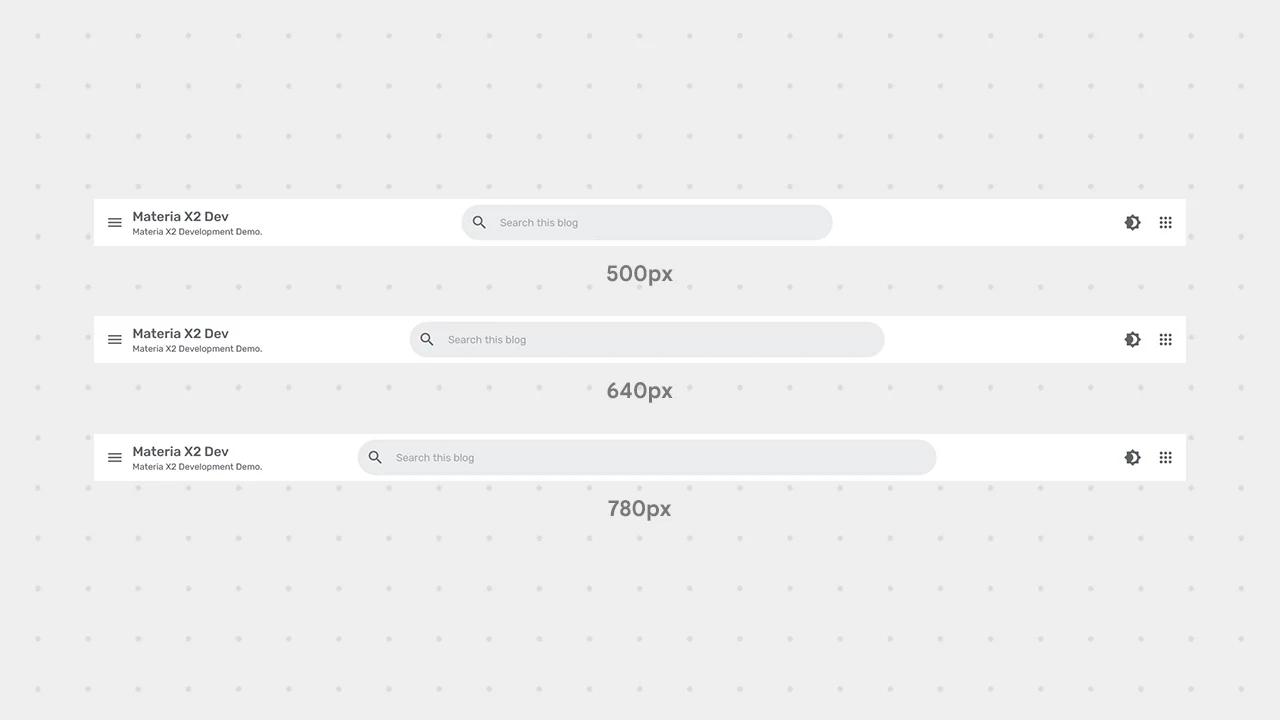
Look for the Option named Search Bar Max Width, drag the slider right or left until you find the Search Bar width you want.

- Click the Save button (diskette icon) in the lower right corner.
Search Bar Visibility on Desktop
This setting is useful for enabling or disabling the visibility of the Search Bar especially on the Desktop Screen.
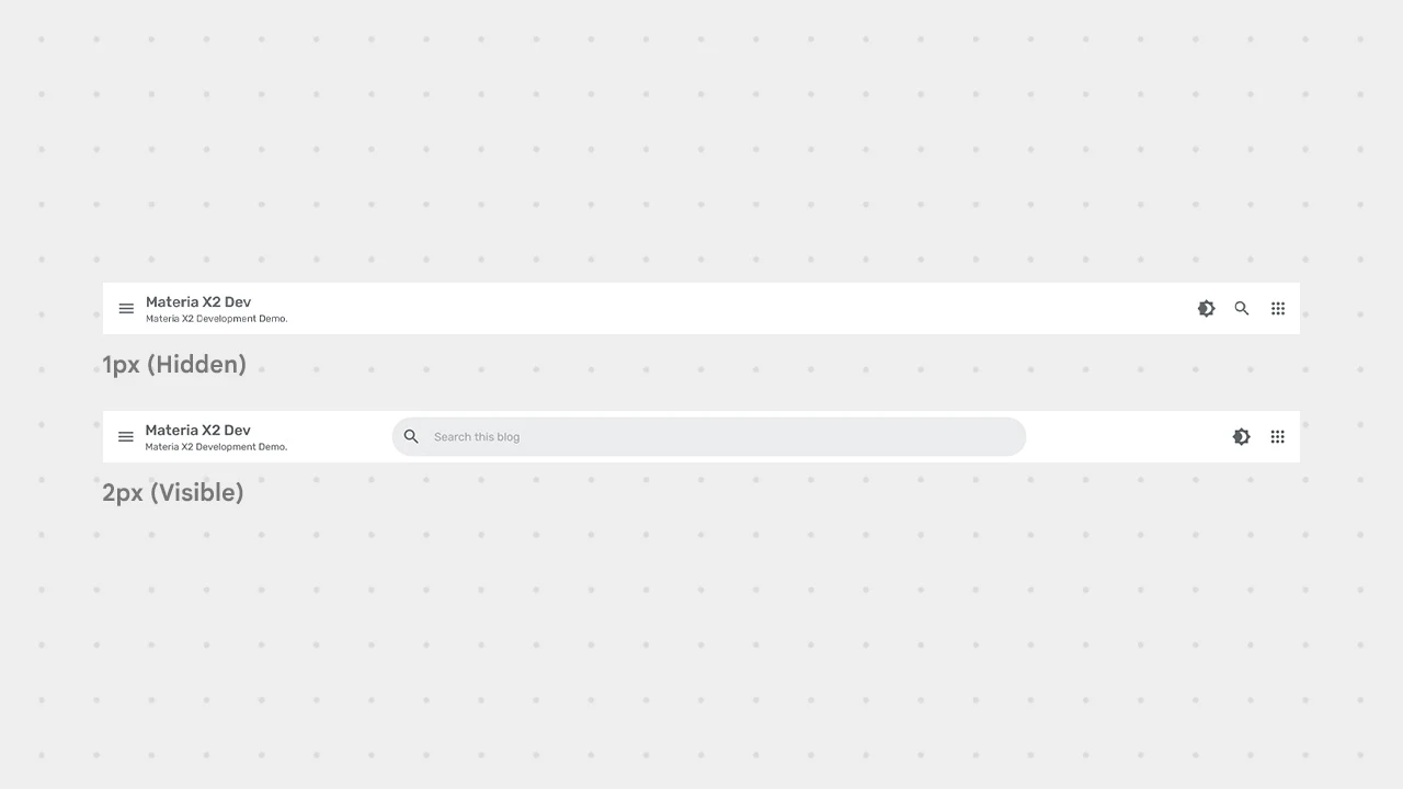
If you set the Search Bar Visibility to 1px (Hidden), the search icon will appear, just like how it looks on Mobile screen. Here are some steps to customize and some explanations:
YouTube Video: Indonesian Guide (Subtitles/Closed Captions available).- Go to Blogger Dashboard and select the Theme menu.
- Click the CUSTOMIZE button.
- Click Advanced, click Default OptionsDropdown and SelectNavbar Options.
-
Look for the Option named Search Bar Visibility on Desktop (Hidden | Visible), drag the slider right or left. Here is the explanation:

- 1px: Hidden - Search Bar will be Hidden.
- 2px: Visible - Search Bar will be Visible.
- Click the Save button (diskette icon) in the lower right corner.
Search Bar Corner Radius
This setting is useful for setting the rounded corner radius for the Search Bar. Here are some steps to customize and some explanations:
YouTube Video: Indonesian Guide (Subtitles/Closed Captions available).- Go to Blogger Dashboard and select the Theme menu.
- Click the CUSTOMIZE button.
- Click Advanced, click Default Options Dropdown and Select Navbar Options.
-
Look for the Option named Search Bar Corner Radius, drag the slider right or left until you find the corner radius you want.

- Click the Save button (diskette icon) in the lower right corner.
Color Settings for Header or Navbar
There are several color settings for the Header or Navbar that can be customized, namely:
- Navbar Edge Border Color - To set the Edge Border color on the Header or Navbar.
- Navbar Edge Shadow Color - To set the Edge Shadow color on the Header or Navbar.
- Navbar Background Color - To set the Background color on the Header or Navbar.
- Navbar Text Color - To set the Text color including Buttons on the Header or Navbar.
- The Navbar Edge Border Color setting is only useful if you have set the Navbar Edge Style to 2px (Border Bottom).
- The Navbar Edge Shadow Color setting is only useful if you have set the Navbar Edge Style to 3px (Shadow).
Here are some steps to customize it:
- Go to Blogger Dashboard and select the Theme menu.
- Click the CUSTOMIZE button.
- Click Advanced, click Default Options Dropdown and Select Navbar Options.
- Find a color setting and select the color you want to change.
- Click the Save button (diskette icon) in the lower right corner.
Those are some steps to configure the Header or Navigation Bar in Materia X2 Theme. If you have any questions, please write them in the comments section.
If you want to report some bugs, you can write them in the comments section on the Bug Report page and if you want to request new features or want to provide feedback, please write them in the comments section on the Request and Feedback page.

[image] image_url [/image]
To add a code block:
[code] your_code [/code]
To add a quote:
[quote] your_quote [/quote]
To add a link:
[link] your_link_text | link_url [/link]
[image] https://blogger.googleusercontent.com/img/b/R29vZ2xl/AVvXsEg3VJMZCl2LY88lcnjT9DMlN24SsOvbyaBPpizkiTdybDzzOCTkeEYwfmi9vBKC2nh1on-ijtIxdC-Now-5jqVb3H4FTleursvuuI78hFQUxTTKcSSt5yniwX-FYNiKtnrDg8Jrfe8wpVa5QRHPArNIoiWxCkCE0fVO1_pq0ZUeaBbx1-zE4658ElyJdd_I/s1600/Screenshot%202024-08-12%20at%2018-05-29%20Configuring%20the%20Header%20or%20Navigation%20Bar%20in%20Materia%20X2%20Theme%20Materia%20X2.png [/image]
Tetapi dark mode akan mengikuti system perangkat pengguna.
Jika pengguna mengaktifkan dark mode, maka Materia juga akan menjadi dark